Clouds in the sky acting as a background behind the Case study title: "Shuddle".
Powell's
Powell's
What I do

Lorem ipsum dolor sit amet, con setetur adipiscing el.

summary

Redesigning the Powell's digital experience.

Project Role

Product Design

Timeline

July 2024 - December 2024

Disciplines

User and Product Research, Information Architecture, Interface Design

Collaborators

Liz Belka, Nicole Radams, Bob Thomas

Intro

The Question

"How might we improve upon Powell's digital book browsing experience by applying principles of information architecture?"

What I do

Lorem ipsum dolor sit amet, con setetur adipiscing el.

Overview

With its endless maze of shelves and literary treasures, Powell’s City of Books is a beloved cornerstone of downtown Portland. However, its website doesn’t quite capture the same magic. While the in-store experience feels immersive and intuitive, users found the online experience clunky and frustrating.

In this project, our team set out to reimagine the Powell’s digital experience: how could we bring the wonder of in-person book browsing into the online space?

Design Process

Process

Research, evaluating key usabiltiy issues, and elucidating user needs through prototyping.

Process

Research

To start off this project, our team evaluated the usability of Powell’s current website, then we conducted a series of user interviews to gain a better understanding of how users navigate the site.


During this process, we uncovered a range of interface issues, and we also gained valuable insight into how people browse for books online. Unlike in-store browsing, where discovery feels tactile and immersive, online users tend to skim quickly and rely heavily on clear organization to guide their choices. These were some of our findings.

Search Bar as Primary Tool

Users overwhelmingly relied on the search bar both for finding specific titles and for general browsing.

01
Confusing Navigation

The site’s information hierarchy and navigation were major pain points; users often struggled to locate pages through menus alone.

02
Lack of Quick Book Previews

Users wanted a faster way to scan summaries and compare books. Unlike in a physical store where summaries are just a flip away, Powell’s current site requires too much effort to access basic info, disrupting the flow of browsing.

03
Satisficing

Interestingly, users weren’t always hunting for the perfect book - they were often satisfied with a title that felt “good enough.” This satisficing behavior emphasized the need for accessible overviews and an easy, low-effort way to explore options.

04
Process

The Architecture of Discovery

In a way, the Powell's website was very much laid out like its physical store. Winding, maze-like, and seemingly never ending. Instead of generating wonder and inviting exploration like its physical counterpart, however, the same structure manifested in the digital realm only led to frustration and confusion. The way the website was designed was not compatible with how people browse for books online. At the core, we were facing an information architecture challenge.


In this phase, we asked: How do people actually want to browse for books online? What kinds of filters feel meaningful? How should results be displayed? During this stage, we created user personas, journeys, and sitemaps to better understand how our users interacted with the site.

Process

Ideation & Testing

In this phase, we focused on reimagining the overall structure and flow of the Powell’s digital experience.
With a mobile-first approach, we worked to improve the site’s information architecture to create a more intuitive browsing journey across both mobile and desktop. We explored ideas through sketches, wireflows, and low-fidelity wireframes, which evolved into early prototypes.

We also conducted usability testing on initial sketches and wireframes, gathering valuable insights. The following are the major design decisions that arose from our ideation process and subsequent user feedback.

Redesigned Hierarchy

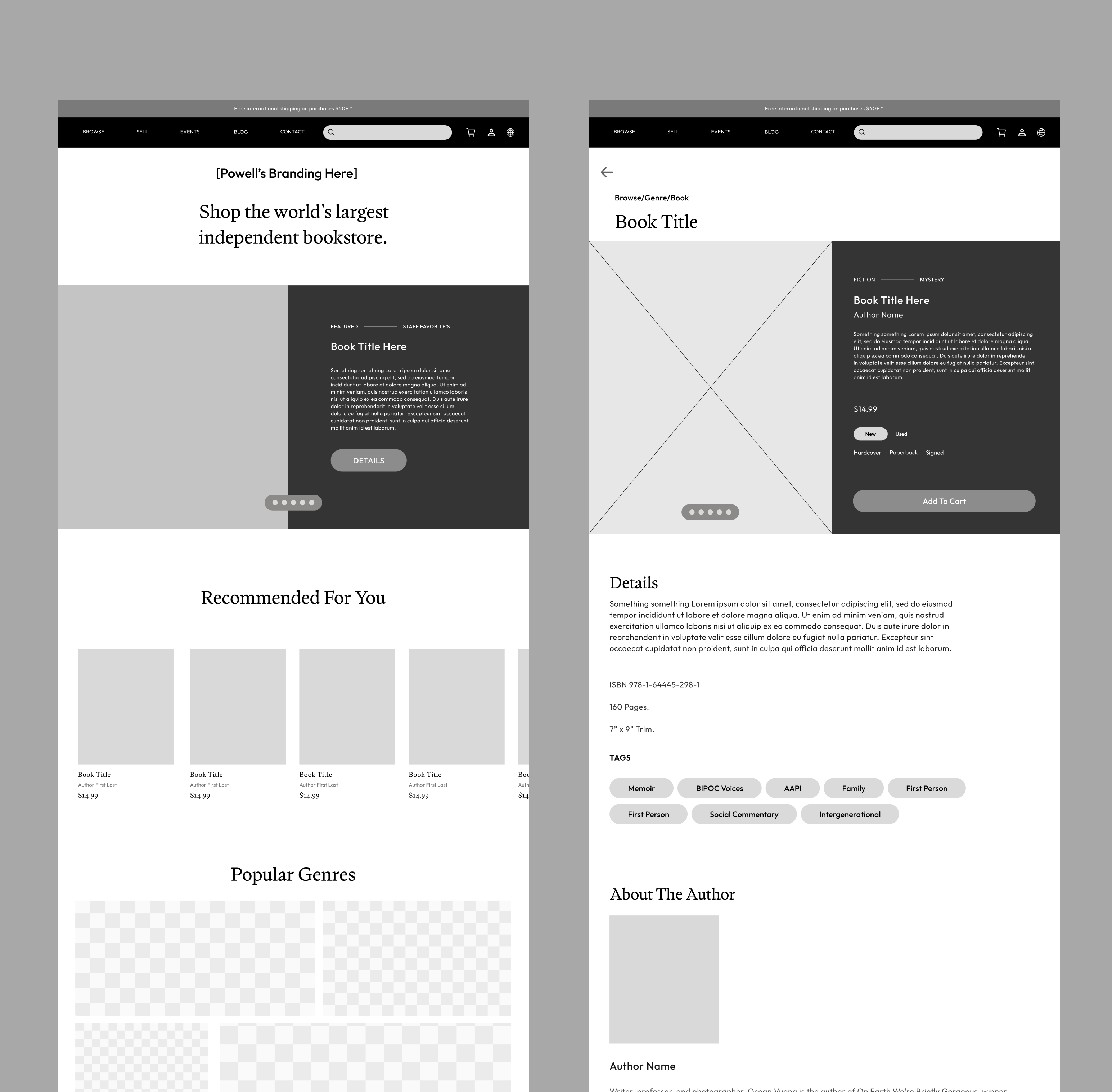
We restructured the site’s overall hierarchy to help users find value faster. Major changes included updating the homepage and reorganizing the menus.

01
Improved Browsing

We simplified navigation to support quicker discovery, introducing an image-based genre categories page to guide users more intuitively through the site.

02
Tags

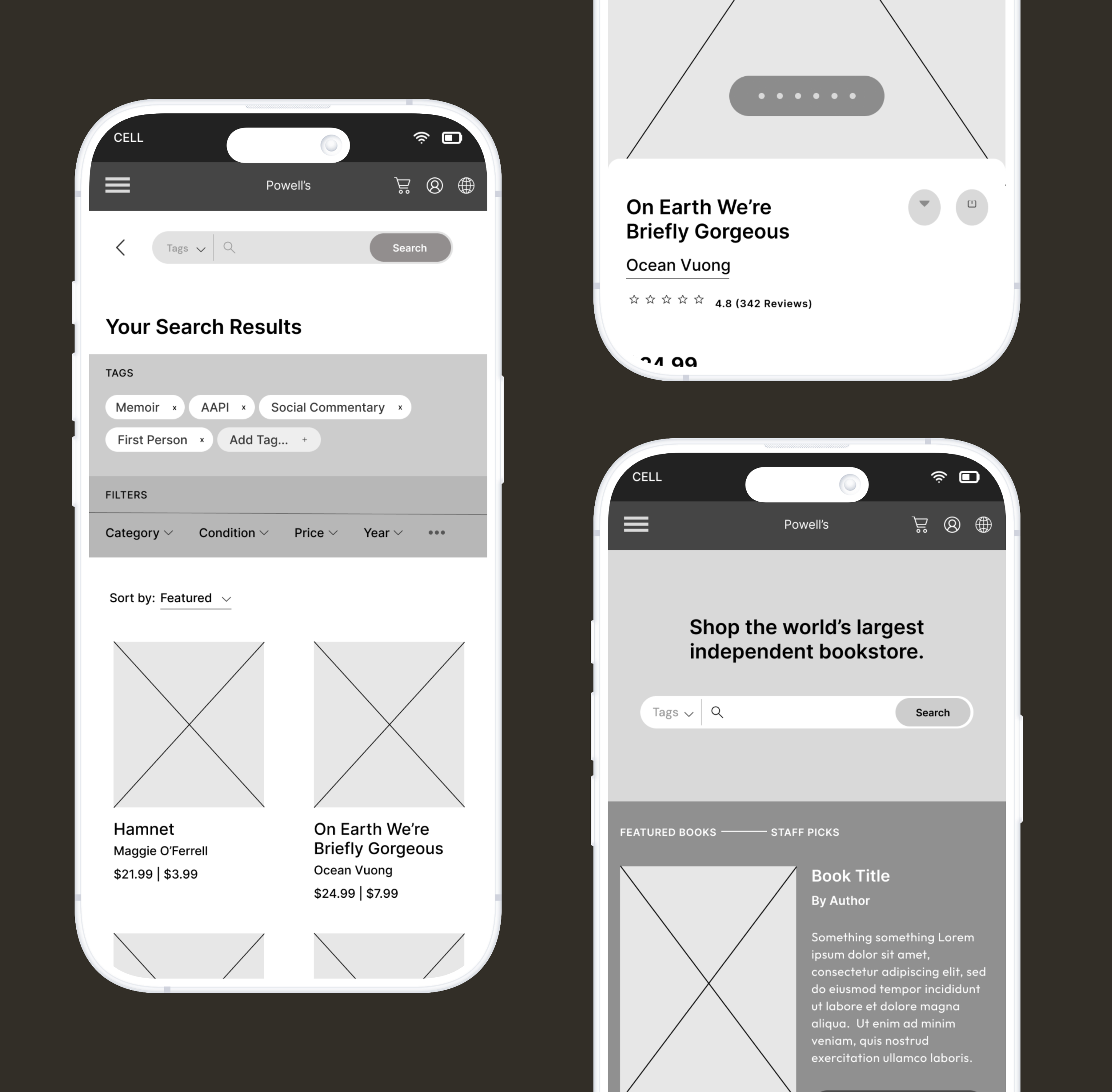
We introduced topic-based tags (e.g., “male protagonist", "POC Author") to solve the problem of too many irrelevant search results.

03
Responsive Design

We designed adaptable interfaces that made sense on both mobile and desktop, prioritizing clarity and minimizing cognitive overload.

04
Results

Solutions

The following features highlight specific changes made to the design as a result of early user feedback.

What I do

Lorem ipsum dolor sit amet, con setetur adipiscing el.

Results

Tags

When asked to browse for a specific topic, it wasn't uncommon for our test participants to be faced with over 400+ pages of results. Users felt frustrated by the existing filters, as they simply couldn't achieve the level of granularity required to index such a massive catalog of products.

Thus, tags were proposed as a solution. Tags work by creating cross-sectional "search zones" based on qualitative aspects of a book. Tags can be broad (i.e. "First Person Perspective"), specific ("Male Protagonist"), or layered with each other to further narrow search results. Some of our calculations put us at a potential 85-90% reduction in the number of irrelevant search results as a result of implementing tags.

Testing will need to be done in a future iteration of this feature in order to determine the types of tag labels that would be most helpful for users.

Results

Collections

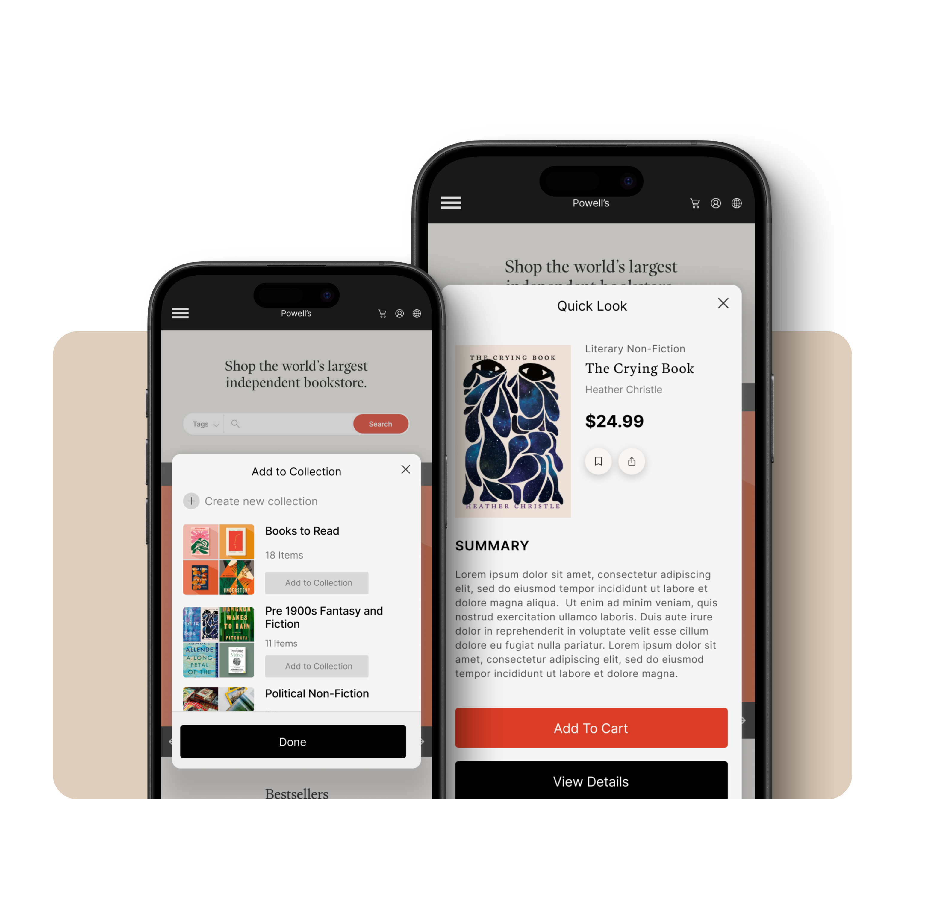
Collection lists were introduced because users expressed a need to save and efficiently compare books.

Summaries

When you want to know what a book is about, you can physically flip to the back cover or the inside flap to read the summary. There wasn't an easy way to do this quickly on the Powell's site. Summary pop-ups were the proposed solution for this problem, as it allows users to quickly skim summaries and access a book's key information without interrupting their browsing process.

What I do

Lorem ipsum dolor sit amet, con setetur adipiscing el.

What I do

Lorem ipsum dolor sit amet, con setetur adipiscing el.

Results

Improved Filters & IA

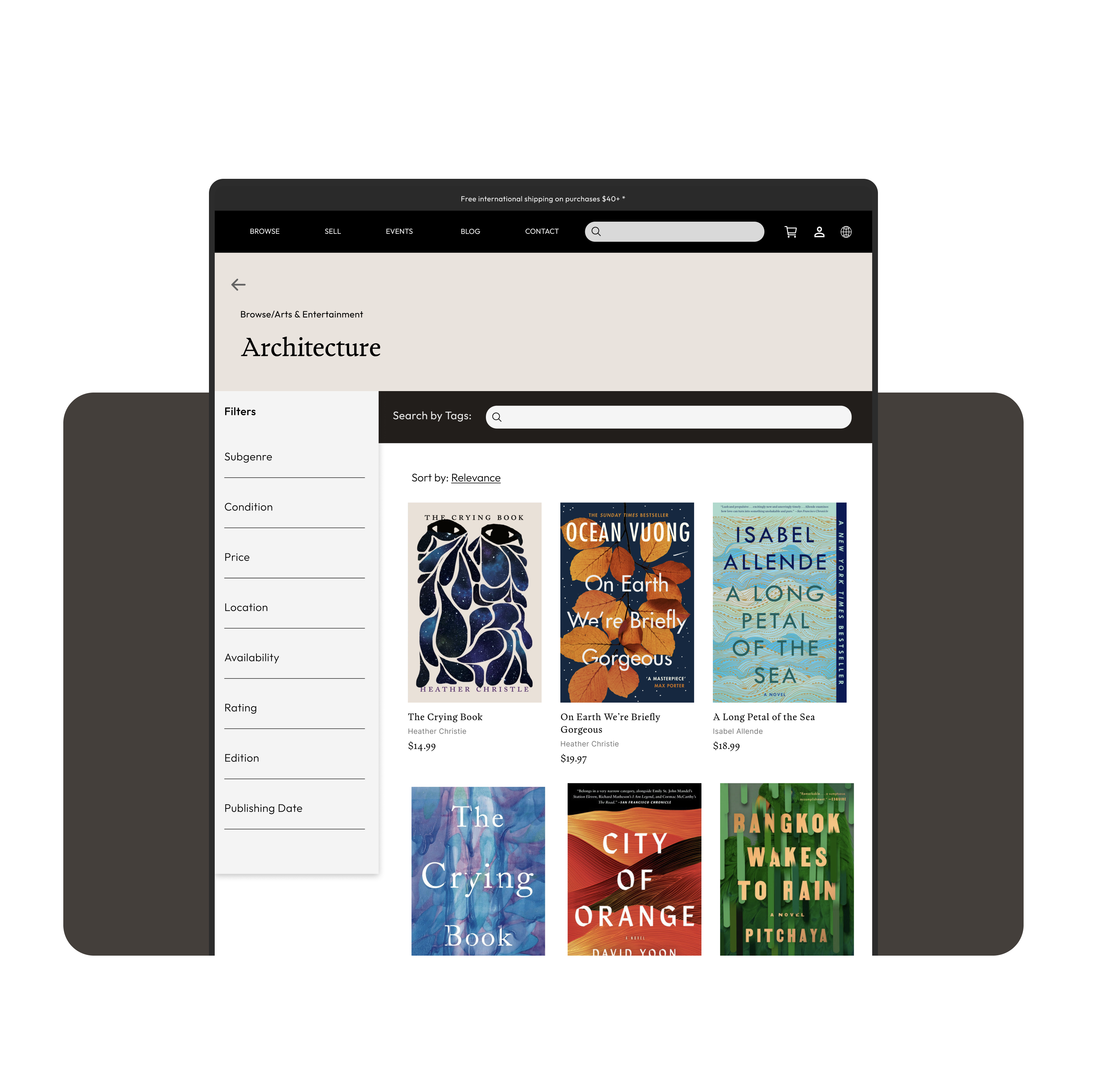
On the original Powell's website, using filters was the only way to narrow down searches, which meant that the list of filters was overwhelmingly long, and the sidebar was a nightmare to navigate.

We realized that filters generally fell into two categories: topical, regarding content, or informational - regarding details like book condition, edition, publishing year, etc.

Upon introducing tags to filter by topic, it became very clear that traditional filters could then be used to narrow down searches by the informational aspects of books.

Case Study

Want to see more? View the full case study here.

View case study