Clouds in the sky acting as a background behind the Case study title: "Shuddle".
Theia
Theia
What I do

Lorem ipsum dolor sit amet, con setetur adipiscing el.

summary

AI-powered hormone tracking and evaluation.

Project Role

Product Design

Timeline

March 2025 - July 2025

Disciplines

User Research, User Testing, AI Design, Product Design

Collaborators

N/A

Intro

The Question

"How might we provide people with clarity and insights about their hormonal conditions?"

What I do

Lorem ipsum dolor sit amet, con setetur adipiscing el.

Overview

Polycystic Ovarian Syndrome (PCOS) is a hormonal condition that can cause debilitating physical and emotional symptoms. Despite being a relatively common hormonal condition, it is notoriously difficult to diagnose and treat.

My research for this project consisted of having various, oftentimes emotionally heavy conversations with women diagnosed with hormonal conditions such as PCOS. Through this, I found a problem, which was that these women generally did not have a clear understanding of what was happening in their bodies at a hormonal level. In this case study, I share the findings from an extensive exploration into these conditions, aiming to offer an accessible and user-centered approach to finding treatment and managing symptoms.

Design Process

Process

Conducting research, generating deliverables, and iterating on user testing to clarify user needs.

Process

Research

I started research for this project by first diving into peer-reviewed articles. At this stage, I wanted to know: how are hormonal conditions currently treated, and where does technology fit into that picture? From there, I shifted to speaking directly with people, conducting user interviews and releasing a survey that gathered 32 responses. These conversations and data points began to paint a clear picture of the real challenges people face, which led to the following insights:

(Below: A graphic made to summarize some survey findings)

Lack of Knowledge

Participants mentioned that there was a lack of research regarding hormonal imbalances, meaning that it takes effort to find quality, comprehensive information.

01
Misinformation

There is a lot of misinformation around hormonal imbalance conditions. Participants reported that there's a plethora of pseudoscience and anecdotal treatments that either don't work or cause more harm than good.

02
Barriers to Treatment

Barriers to receiving treatment include the high cost of treatment, the lack of high quality, knowledgeable specialists, and the time it takes to get a diagnosis.

03
Privacy Concerns

Participants expressed concern about health data privacy, citing concerns regarding sensitive data being sold, or with issues concerning surveillance.

04
Process

Uncovering Invisible Journeys

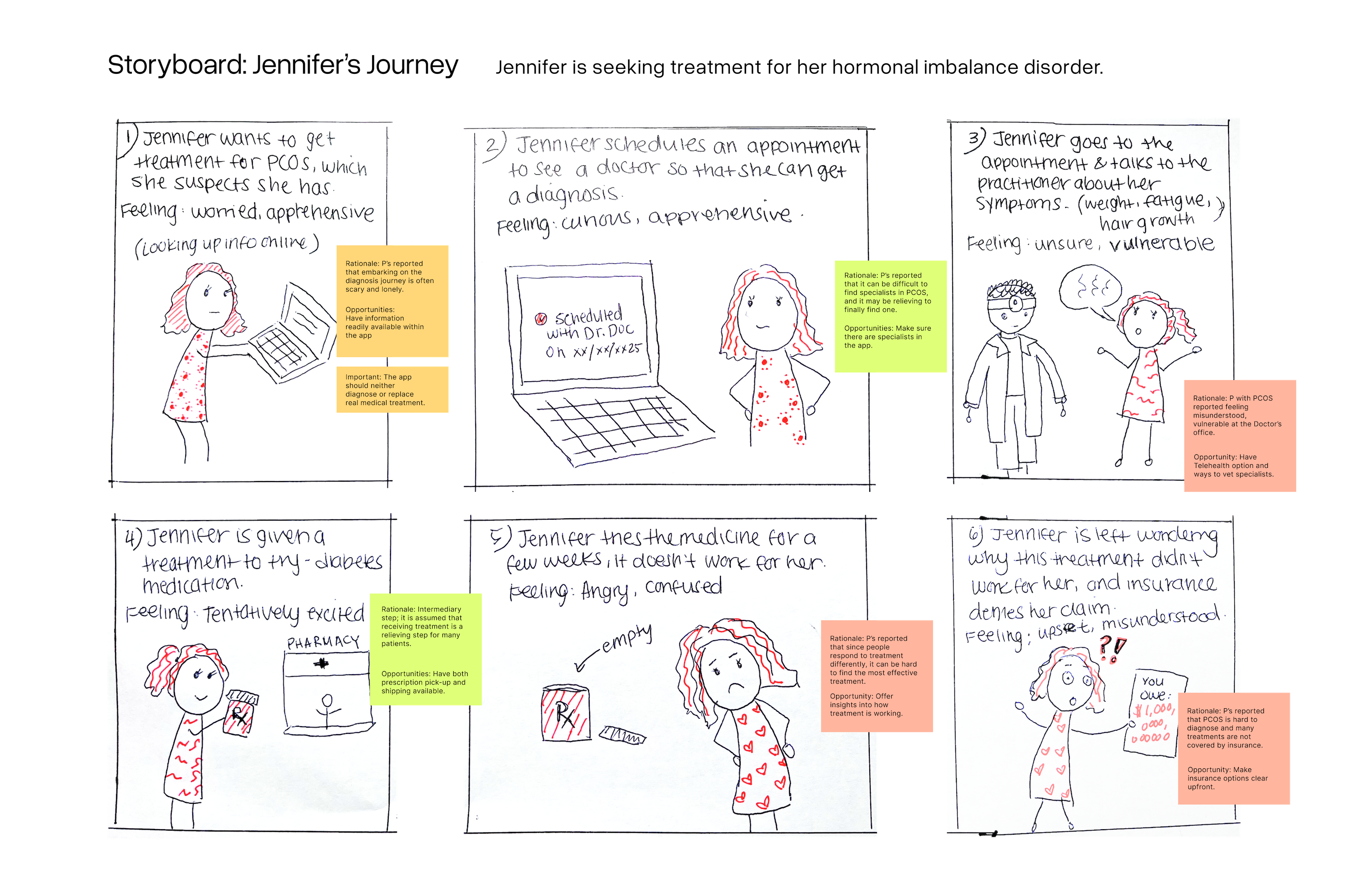
One poignant, recurring theme that came up during research was that the people I talked to often mentioned that the same hormonal condition could look completely different from one person to the next, making the path to diagnosis and treatment not only complex but often emotionally difficult. This reinforced the need to approach this problem with empathy, so I intentionally spent a lot of time understanding these diverse experiences by mapping them through personas, journeys, and storyboards. This work became the foundation for identifying user needs that account for the unique situations that users might find themselves in.

Process

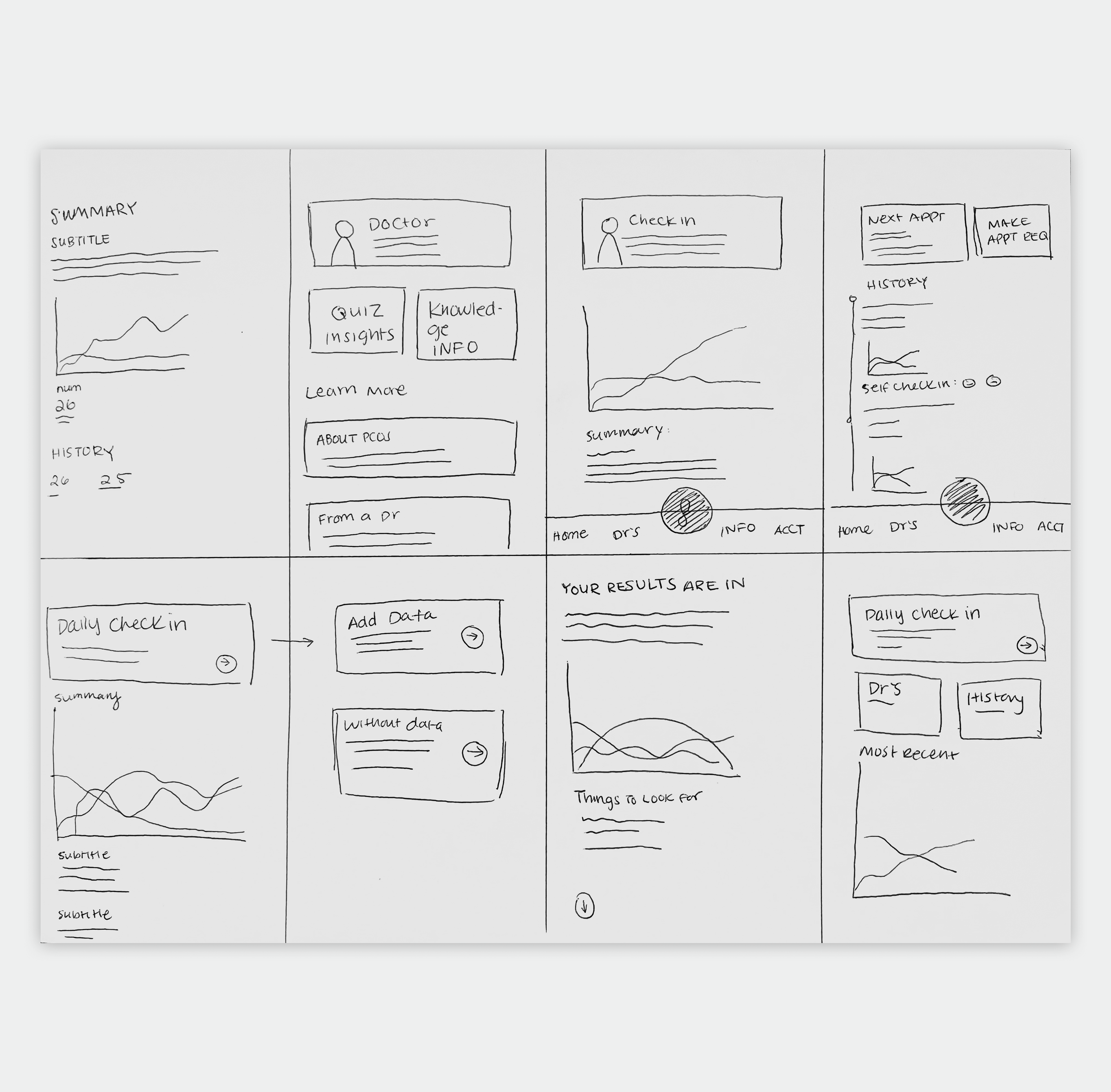
In this next phase, I generated ideas and sketches based on the user needs I identified. I mapped out flow diagrams from the wireframes that I created from those sketches, and finally created preliminary prototypes of the major screens with interactions, colors, and images. I gathered feedback at every stage of this process, testing the sketches, wireframes, and rudimentary prototype with users. These were a few of the major findings that informed the creation of the first version prototype.

Main features not prominent

One of the most important pieces of feedback from users was that the main features of the app - check-in and hormone tracking - were not prominent enough.

01
Community Page

The feedback about the "Community/Learning" page was mixed - some users reported that they would never use a feature like this, while others emphasized its importance.

02
Confusing icons and terminology

When asked to complete certain tasks, users would often land on the wrong page, citing confusing nav bar icons, or unclear terminology.

03
Colors

Finally, I received negative feedback about the colors that I chose for the preliminary prototype, with users citing potential problems with accessibility and color associations.

04
Results

Solutions

Feature changes and additions made to the prototype based on user feedback collected during testing.

What I do

Lorem ipsum dolor sit amet, con setetur adipiscing el.

Results

Homepage

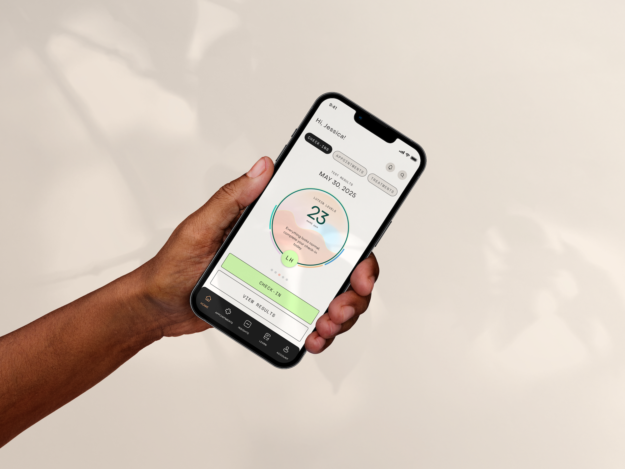
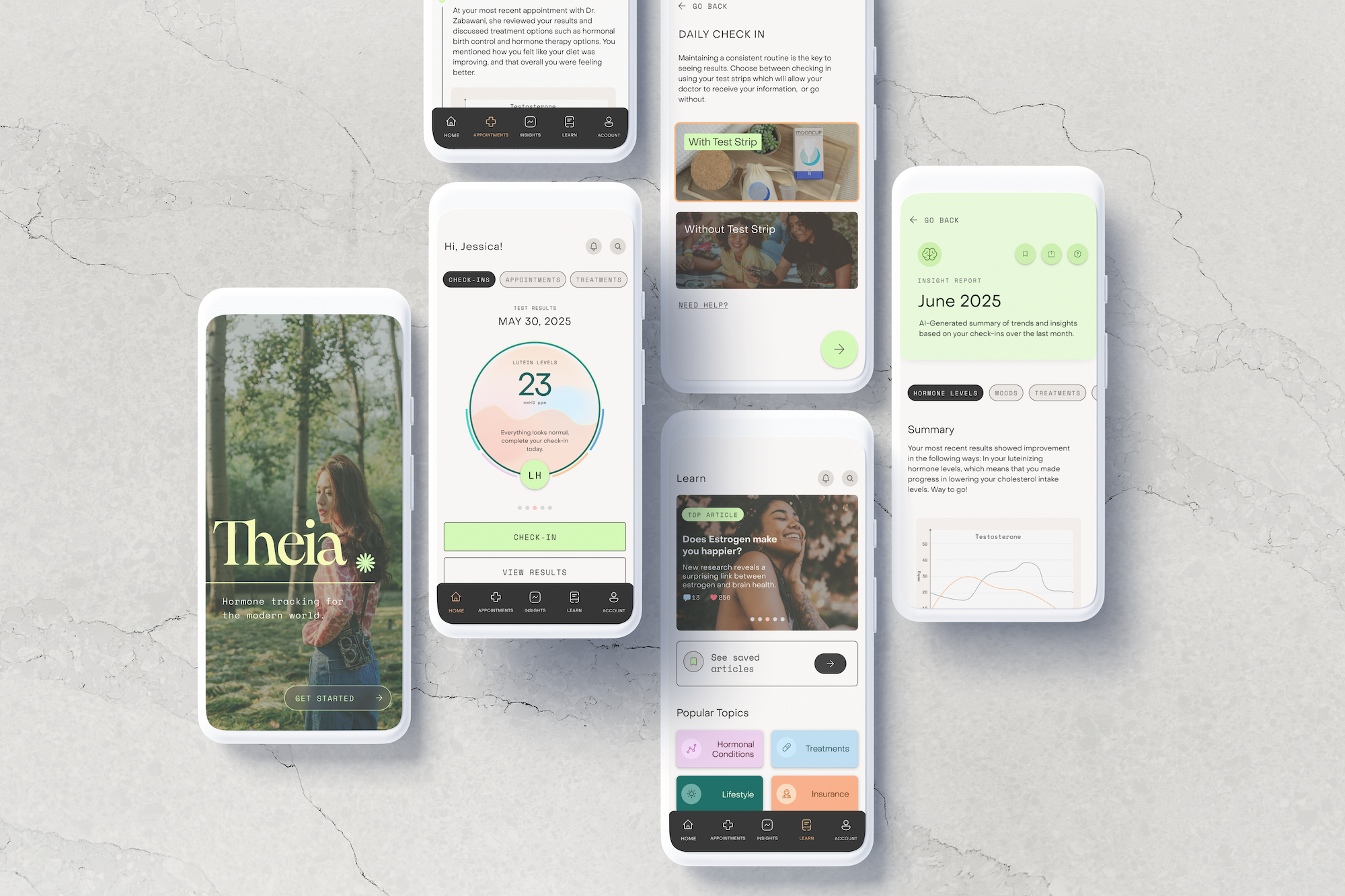
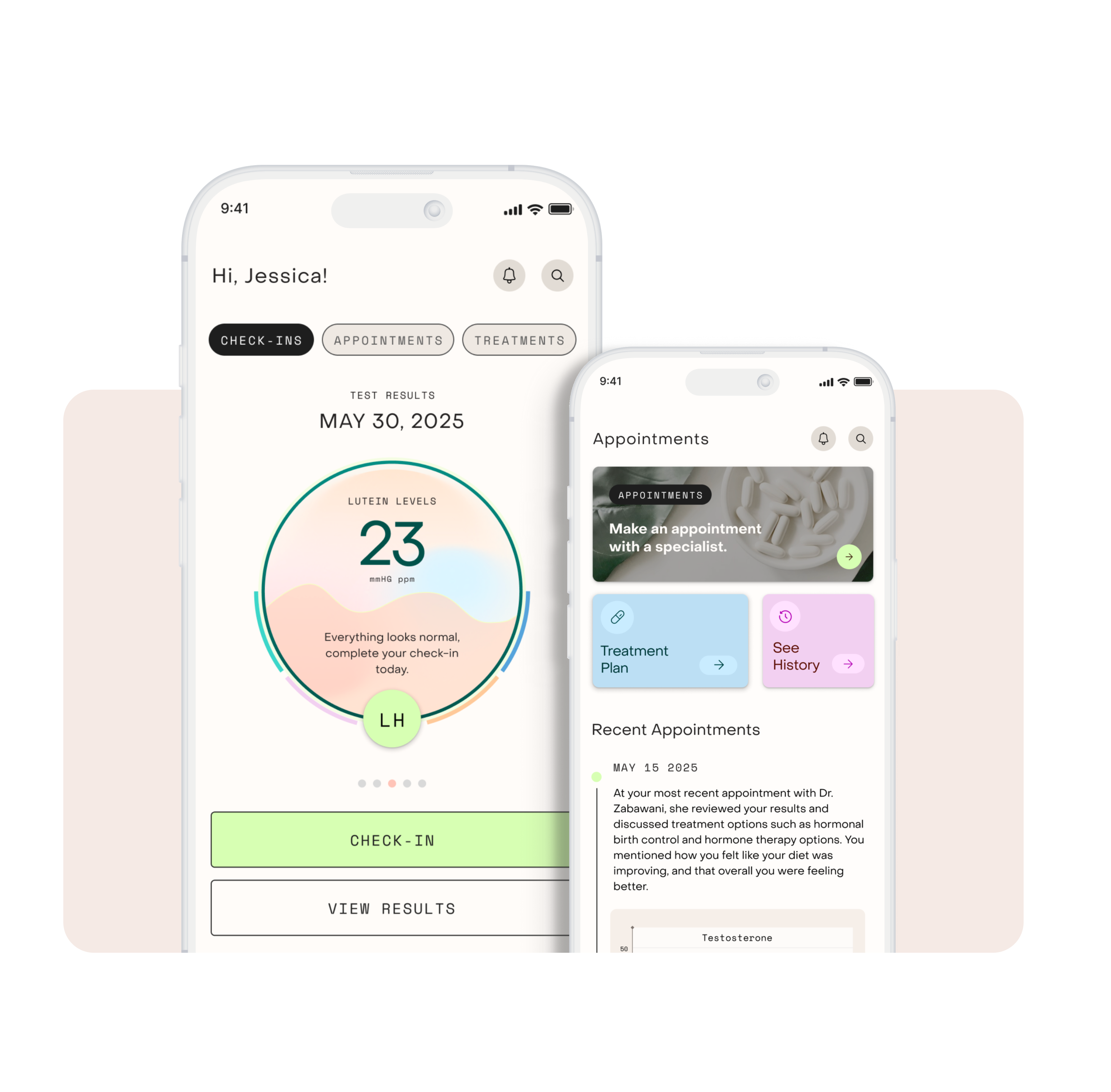
One of the biggest changes that I made to the prototype as a result of user feedback was to the homepage. Users reported that the main purpose of the app was not very clear, so I redesigned the screen to include this circular UI element that displays users' hormone levels, allowing users to see their results right away thus providing value faster than the original design did.

Appointments

Appointments were determined to be a major user need based on research results, namely the findings that it was hard to find specialist support, that finding responsive treatments often took a long time, and that the entire diagnosis process could feel rushed and impersonal.

Results

AI Insights

Users generally responded positively to the idea of having an AI-generated insight report about their hormonal levels. However, users expressed that they'd be only comfortable so long as the AI did not take the place of a human practitioner, meaning the AI shouldn't diagnose or provide real medical advice.

In regards to interface changes, I streamlined the Insight Report page by including various breakdowns by different data aspects. I also made changes to colors and labeling to make navigation more clear.

What I do

Lorem ipsum dolor sit amet, con setetur adipiscing el.

What I do

Lorem ipsum dolor sit amet, con setetur adipiscing el.

Results

Community & Learning

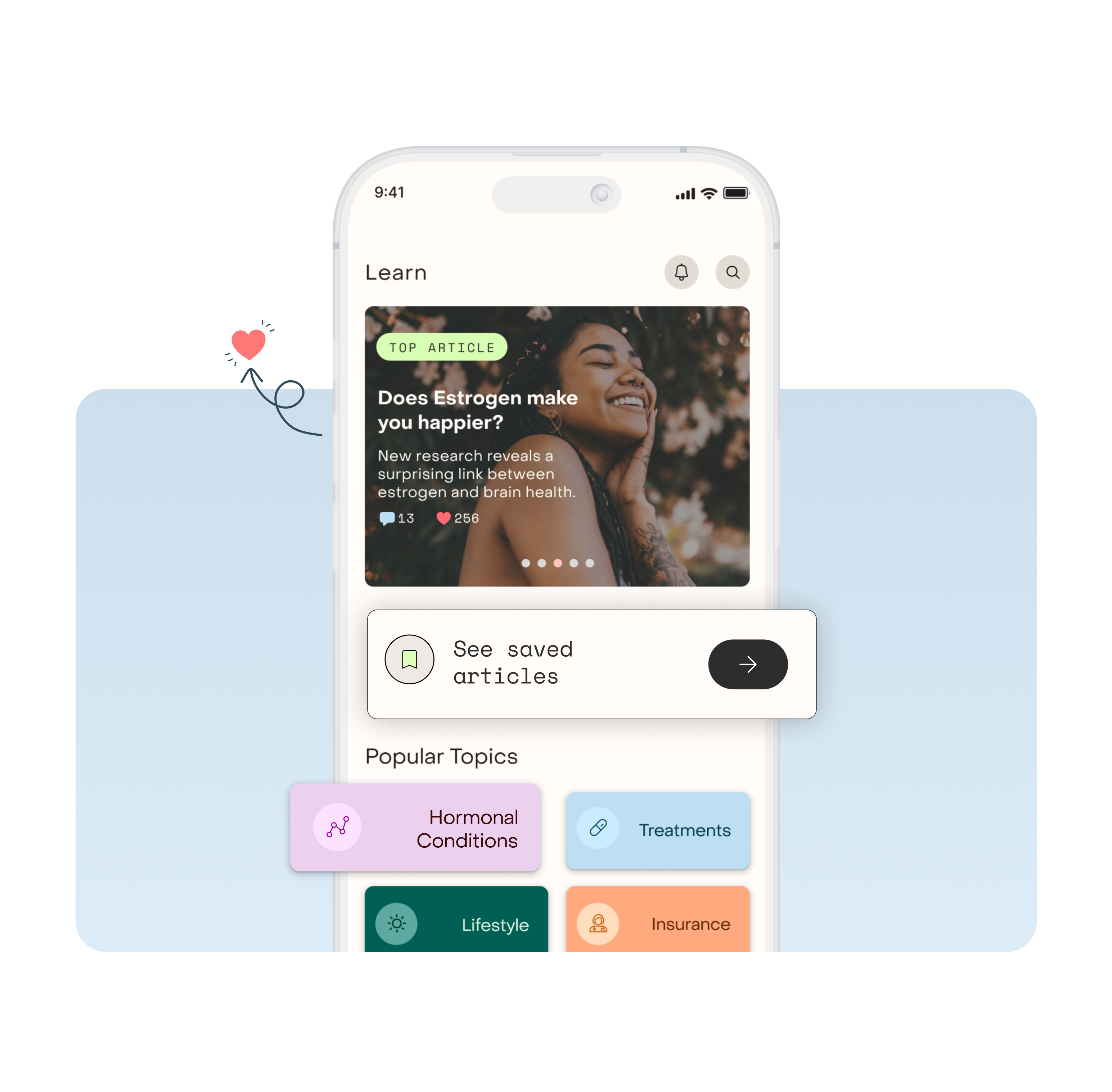
This feature was surprisingly controversial and caused quite a bit of drama amongst users. This feature was included because needs for community and learning resources about hormonal conditions were identified during research.

During testing some users reacted strongly against this feature, reporting that they never personally use community features within apps. Other users pushed against that feedback, saying that this feature would fulfill a missing need within the community. Ultimately, I kept the entire feature but decided to emphasize the learning aspect over community-finding; I ended up including social-media like elements to encourage low-stakes interactions between users.

Case Study

Want to see more? Read the full case study here.

View case study